Just like an unruly child, the Confused Capitalist has passed his first birthday on this earthly plane (... this blog was started February 18 2006), with a happy smile on his face.
Hopefully, I've written something a little bit different from everybody else and something that others have found worthwhile; I've generally had fun doing this. A promotion in the latter part of last year kept me busier than usual, hence the relatively infrequent blogging over the past six months.
However, as the Confused Capitalist enjoys writing both as a means to learn, self-inform, and teach others, I will be launching an environmental/global warming blog later this year. I hope some of you might wander over there when this is launched for some ideas, insight and discussion as we move towards a sustainable future, before all the natural systems begin completely failing.
In the meantime ... happy birthday to me ... happy birthday to me ... to me ... :-)
JW
The Confused Capitalist
A celebration of the stock market by Jay Walker, author of The Brink's Truck Burst Open on Wall Street! A Holistic Approach to Finding The Easy Money In Common Stocks. Facts and ideas on how to outperform the general market, portfolio management and risk, with a growing focus on how climate change should affect your investment strategy. All wrapped nicely with a value-oriented investing bias.
Tuesday, February 27, 2007
Saturday, February 17, 2007
How Low Can You Get? Extremely Low PEs Crush Market Averages
A series of stories on extreme low PEs is interesting in that it shows two things:
Firstly, that the "Rise of The Machine" has value for investing purposes (i.e. automatic selection without further human intervention, once the investment criteria rules are written).
This is currently being exploited through many semi-active and enhanced ETFs, like the Power Shares, Wisdom Tree and Claymore Investment types, and through "value screen" investing.
The second interesting thing is that extreme value situations crush market averages.
Here are the stories of John Dorfman's extreme value investing via his "Robot Portfolio":
2006 Portfolio
2005 Portfolio
2004 Portfolio
2003 Portfolio
2007 Canadian Version
I hope these stories prove useful to you.
JW
The Confused Capitalist
Sunday, February 11, 2007
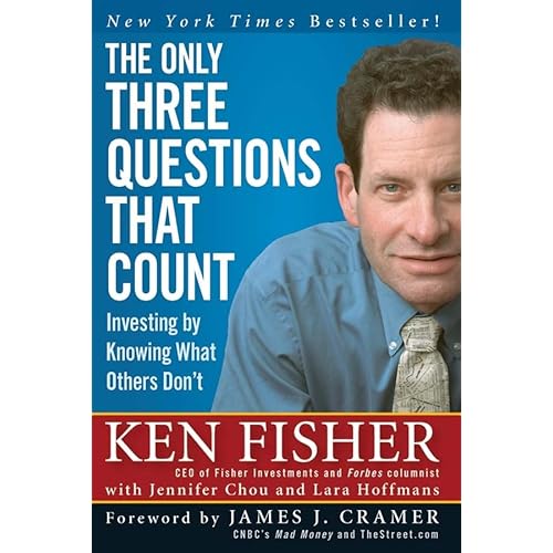
The Only Three Questions That Count
This is part 2 of 2, relating to a review of Mr. Fisher's book. The first segment is here.
I have some issues with Mr. Fisher's book and some of his "revolutionary" thinking. Given the tone of his book, I'm certain he would be absolutely dismissive of what I have to say but, nevertheless, I'm going to charge in anyway.
Mr. Fisher's big opening statement in his book challenges a long-held market axiom that high PE's denote reduced returns for some period of time into the future. He states that the year immediately following a high PE year has virtually no statistical inverse correlation. While this might be true, it ignores the fact that there is heightened risk of a reduced return into the relatively near term future. Whether that lower return is realized in the immediate year following, Mr. Fisher's data suggests, no.
However, an investor (rather than a "speculator" or "trader") would be foolish to ignore the reduced odds of outperformance that this period provides. For some further information and a detailed study on this issue, please go over to this Gannon On Investing series, which discusses this in greater detail. (Use the top navigation link to continue moving forward in this interesting series). Essentially, Mr. Gannon's work shows that poor returns (perhaps not the immediate year following) generally follow high PE years.
I find that his presentation and discussion of the data is of considerably more value to me than Mr. Fisher's more short-term consideration. In terms of data presentation, in Mr. Fisher's book, in an attempt to convince that there's virtually no correlation between PEs and market returns, he presents what he calls a "Bell Curve" showing relative PEs. Here is a truncated version of his "Bell Curve":
(see Figure 1.3 on page 18 of the book).
When I look at this, it doesn't remind me of a Bell Curve, which I always understood to look something like this ...
... so when I look at it, my mind still tries to fit a rough bell curve to it. What I can clearly see is that, on the periphery, there appears to be a clear correlation between average returns and PEs. For instance, the average return from the 11 occurrences in the far left hand (low PEs) column is 20.0%. If I aggregate all the small right hand columns (High PEs), this totals some 17 occurrences, and the average return there is just 6.5%.
Perhaps a better way to think about this, I arrive at, is that in the middle values, the PE isn't the most important determinant of future return. But on the edges, it's clearly very important. Geoff Gannon's work certainly supports this thesis too. But I know that Mr. Fisher would probably be completely dismissive of me, attributing my criticisms to my inability to ditch an old world view.
Later in the book, he puts to rest another worry, that high government deficits and debt result in poor market returns. Don't Worry!, his research shows, Be Happy! I'd say that the way he approaches this theme is similar to the first; he takes the short term view and therefore "proves" this doesn't impact the market.
I look at it like this: while the party is going on with borrowed money, all looks great. There's no evidence to suggest that the house will be trashed the next morning and in dire need of repair. Party on dudes!
However, over the longer term, a sensible brain would say that the money is going to have to be paid back, and given the the US already has one of the lower tax regimes in the developed world (suggesting that the opportunity for service cuts are somewhat limited), how will this money likely be paid back? Hummm, by raising taxes, perhaps even corporate taxes?? And when taxes are raised, what is that likely to do to corporate profits, or at least profit growth rates?
In summary, I find that Mr. Fisher often takes a relatively short term view in framing his questions, more akin, in my view, to a trader, than a long-term investor. Having said that however, and despite my criticisms here, I still think that the book is a worthwhile read.
Just be careful how you use the outcome of some of the questions that Mr. Fisher frames.
Feb 13/07: I have added this post-script because I think I have probably been somewhat harsh in my criticism of this book. What makes it worthwhile, in my opinion, is that it's one of the very few books out there that shows how a "top-down" approach might succeed.
Most books - mine included - tend to focus on "bottom-up" approaches that focus on relative and absolute valuations. Some wander off into the "asset-allocator" field as a sideline, but few provide any indication of how a top-down approach might be successfully employed and some tools to do that with. Mr. Fisher's book does that.
However, I'd still be cautious as to using the exact answers that Mr. Fisher comes up via his own questions, as I believe there's an inherent amount of risk in ignoring certain longer-term probabilities [something I think that many of Mr. Fisher's questions do] - i.e. poorer longer term returns when investing when PEs are high; and government deficit and debt situations that may act as trigger events for market debacles.
JW
The Confused Capitalist
Saturday, February 10, 2007
Investment Cycle clock
I thought that this graphic, by Merrill Lynch, was worth looking at in terms of where they see the economy in the cycle, and the type of investments they generally see as outperforming during any particular part of the cycle.
The other thing I thought I might try taking a stab at is how long each portion of the cycle typically lasts. Based only on my observation over time, I might suggest that the cycle has roughly 3,4,2,1 counts. My (un)educated guess is that the recovery portion usually is 3 helpings of time, the boom is 4 portions of time, the slowdown is 2 portions and the recession is 1 portion of time.
Using something like this clock may help you to time your type of investments a little better.
Hat tip to the Big Picture for this worthwhile graphic and also to his continuing coverage of the housing situation. Unlike many analysts, Barry Ritholtz has figured out where that particular train is headed (and it's not to the "Happy Days Are Here Again" station, just yet).
JW
The Confused Capitalist
Subscribe to:
Posts (Atom)